Nike Air Zoom
Pegasus 41
A high-performance conceptual UI exploration focused on premium sports branding, bold typography, and dynamic product storytelling.
Engineered for speed.
Project Overview
This UI concept reimagines the digital product launch experience for Nike's flagship running shoe. The interface breaks away from traditional e-commerce grids, adopting a dramatic, immersive storytelling canvas that prioritizes emotional connection over simple transactional logic.
Design Goals
The primary objective was to capture the kinetic energy and "forward motion" inherent to the Nike brand. The layout must feel aggressively modern, utilizing extreme contrast, oversized typography, and deep spatial layers to hero the product.
Motion captured in pixels.
The digital identity mirrors the physical product: lightweight, responsive, and precision-engineered. The dark backdrop serves as an infinite stage for the vibrant Volt Green accents to explode.
Brand Identity
Adhering to Nike's unapologetic visual language, the UI utilizes stark blacks, industrial greys, and high-energy neon hues. The aesthetic is heavily inspired by brutalist sports marketing—bold, raw, and impactful.
Product Experience
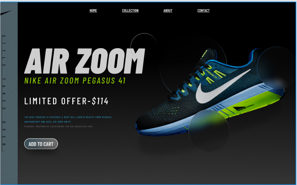
Users don't just view the shoe; they explore it. The interface uses overlapping glassmorphic orbs and structural boundary lines to create depth, pulling the viewer's eye exactly where the engineering happens.
Typography & Color System
- Headline Typography: Heavy, italicized sans-serif weights dominate the visual space, mimicking physical speed and forward momentum.
- Secondary Typography: Monospaced caps are used for technical specifications and side-bars, evoking an engineering schematic.
- Color System: A strict palette consisting of Void Black, Concrete Grey, Ocean Blue, and the signature Nike Volt Green.
UI Components
- Glassmorphic Orbs: Subtle blurred spheres float behind and over the shoe, creating a sense of three-dimensional space without distracting from the product.
- Vertical Axis Text: The "STYLE TAKES OVER" side-bar grounds the composition and creates a striking editorial frame that breaks standard web conventions.
- Ghost Buttons: The primary CTA uses an outlined pill shape, ensuring it remains visible but doesn't compete with the massive product shot.
Dissecting the Interface.
Aggressive Scaling
Typography acts as architecture rather than simply information. By pushing the "AIR ZOOM" lockup to the absolute boundary of the viewport, it mimics the feeling of physical speed and forces the user to confront the brand identity immediately.
Spatial Layering
Depth is established without relying on traditional drop shadows. By interleaving floating glassmorphic orbs both behind and in front of the high-fidelity shoe render, the UI creates a dynamic 3D volume that feels inherently modern.
Calculated impact.
Visual Hierarchy
The eye is intentionally guided in an inverted 'Z' pattern. It starts at the massive "AIR ZOOM" typographic lockup, drops down the aggressive Volt Green subheader, and sweeps across the highly detailed product render before landing on the CTA.
Responsive Thinking
Translating an editorial desktop layout to mobile requires shifting from a horizontal narrative to a vertical stack. The typography scales fluidly using CSS clamp functions, ensuring the aggressive impact of the headlines is maintained on 320px screens.
Technical Implementation
The layout is constructed using advanced CSS Grid to easily manage overlapping layers without heavy absolute positioning. The glassmorphism is achieved using `backdrop-filter: blur()`, heavily optimized to prevent GPU lag.
Challenges
- Balancing Contrast: Ensuring the delicate technical blue text remained readable against the dark gradient background without losing its subtlety.
- Layer Management: Coordinating z-indexes for the vertical sidebar, the background orbs, the shoe render, and the foreground glass effects to maintain a cohesive 3D space.
- Typographic Tension: Pushing font sizes to their absolute maximum limits while ensuring no layout breaks across intermediate tablet breakpoints.
Closing the loop.
Results
The resulting concept successfully demonstrates how premium sports branding can transcend basic e-commerce templates. The interface feels less like a store and more like a high-end product showcase, elevating the perceived value of the sneaker.
Lessons Learned
I discovered that aggressive, oversized typography acts as a structural element, not just content. When text is large enough, it becomes an architectural anchor for the rest of the composition, demanding negative space to balance its weight.
Future Improvements
Future iterations would introduce Scroll-Linked WebGL animations, allowing the shoe to rotate in 3D space as the user scrolls down the page. Additionally, adding interactive hotspots to the shoe would reveal deeper technical specifications dynamically.